This is the first time that the company created a color instead of selecting from a pre-existing palette.

As we soldier through another year yet again marred with moments of isolation and ambiguity, we look to the future a little bit more hopeful, our insecurities getting gradually replaced by intrigue and inquisitiveness towards all things novel. For Pantone, that’s the spirit that they were expecting to encapsulate when they chose 2022’s Color of the Year: Very Peri.
Read: Wonder Plays Dress-Up: The Slip and Matching Sets
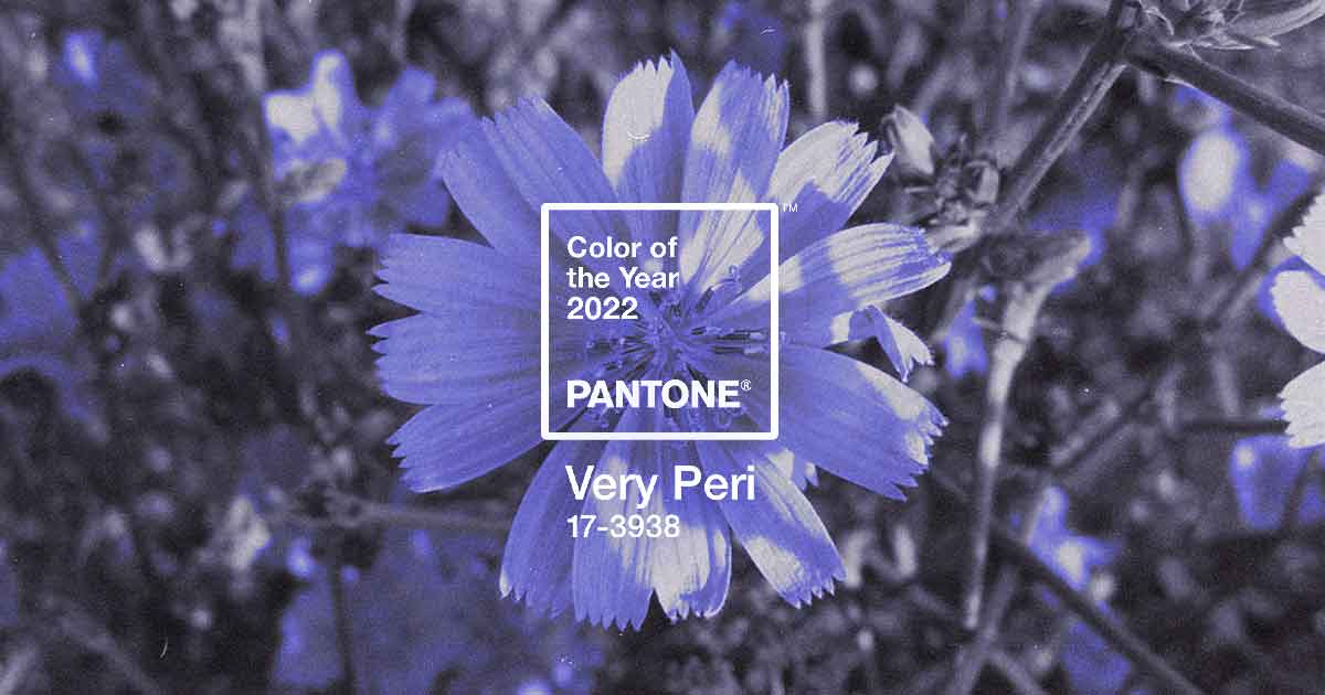
Coded as Pantone 17-393, Very Peri is described as a “dynamic periwinkle blue hue with a vivifying violet red undertone [that] blends the faithfulness and constancy of blue with the energy and excitement of red.”

This is also the first time since Pantone started in 1999 that the company created a color instead of picking from a pre-existing palette, a deliberate move that, in itself, describe the choice.
“It was really important for us to come up with a new color, because we have a very new vision of the world now,” said Leatrice Eiseman, Pantone Color Insititute’s Executive Director, to CNN. “It is literally the happiest and the warmest of all the blue hues. Because of that red undertone, it introduces an empowering feeling of newness, and newness is what we’re looking for.”
“The Pantone Color of the Year reflects what is taking place in our global culture, expressing what people are looking for that color can hope to answer.” added Laurie Pressman, Vice President of the Pantone Color Institute. “Creating a new color for the first time in the history of our PANTONE Color of the Year educational color program reflects the global innovation and transformation taking place.”

Pressman added that the newly-manufactured shade “highlights the expansive possibilities” that the future lay before us.
Each year, Pantone combs through the cultural fibers of society to select what would capture the spirit of the times — be it through design, entertainment, or politics. Its inaugural color, Cerulean Blue, represented the tranquility that is the human spirit entering the new millennium. In 2016, the company chose two gradients for the first time: Rose Quartz and Serenity, which reflected the shifting discourse that surrounds gender politics.
They repeated the act last year by choosing Ultimate Grey and Illuminating as the 2021 Color of The Year. The duality represented the “composure and resilience” of grey and the “optimism and vigor” of the bursting yellow hue.
With Very Peri dictating the mood of the forthcoming year, we sense that a certain popular fan base would be prouder than ever.Â
Art Daniella Sison